AI learning analytics dashboards (built as part of broader AI in education solutions) promise to turn floods of student data into actionable insights for instructors. Unlike static reports that tally logins or grades, these AI-powered dashboards analyze patterns across Learning Management Systems (LMS), Student Information Systems (SIS), and other tools to highlight where teaching interventions are needed. The goal is not more charts – it’s giving educators concrete flags (e.g., which students are at risk, which content isn’t working) that they can act on immediately. This article explores why traditional analytics fall short, how integrating data sources with AI yields smarter instructor dashboards, and what it takes to design these systems for privacy, trust, and real impact.
Why Existing Analytics Don’t Help Instructors Act
Most institutions already collect plenty of learning data – attendance, grades, participation counts. The problem is that many dashboards show what happened, but not what to do next. In fact, faculty often see alerts (e.g. a list of at-risk students) yet “no one owns the next action.” The insights rarely translate into an intervention plan. A report might reveal that discussion posts correlate with higher scores, but if no workflow or support is in place to leverage that, the insight dies on the vine. Simply put, traditional learning analytics stop short of operational change.
Part of the issue is that early analytics tools focused on vanity metrics – convenient measures like login counts or course completion rates that don’t directly guide teaching adjustments. Instructors are left guessing how to respond. Even AI-enhanced systems to date have shown limited causal evidence linking predictions to effective interventions in real classrooms. In practice, an algorithm might predict a student will fail, but if the platform doesn’t suggest or trigger an action (e.g. prompt the instructor to reach out with remediation), its value is theoretical. The feedback loop from data to teaching action is broken.
To truly help instructors act, analytics must move from hindsight to foresight and guidance. This means highlighting not just which students are struggling, but why – and proposing what an instructor could do about it. For example, instead of merely flagging that 5 students scored under 60% on the last quiz, an actionable dashboard might point out that those students all skipped last week’s practice assignment, suggesting a targeted review session. The next sections detail how integrating diverse data and applying AI-driven pattern recognition can enable such proactive coaching.
Data Sources (LMS, SIS, Assessments) and Privacy Constraints
Building a comprehensive instructor dashboard requires connecting data across the academic ecosystem. Key sources include the LMS (e.g. assignment submissions, forum activity, time spent on materials), the SIS (e.g. prior grades, demographics, enrollment status), assessment tools (quiz/test scores, question-level performance), and even learning apps or engagement platforms (like reading tools, coding practice systems). Integrating these silos is foundational – without a unified view, insights will be fragmented. Rather than rip-and-replace existing systems, an integration-first approach uses APIs and standards (see SIS and LMS integration for unified data) to pull data into a central analytics model. This ensures the dashboard reflects a 360° view of student learning in real time.
Data governance is crucial when unifying sensitive student information. Regulations like FERPA in the U.S. (and GDPR in Europe) impose strict limits on how student records are collected, used, and shared. Any AI learning analytics solution must be designed with privacy by design from day one. Role-based access controls should ensure that instructors only see data for students they teach, and any cross-course analytics are anonymized or aggregated. Many institutions now also minimize data collection to only what supports learning goals and vet third-party EdTech vendors for compliance with the same privacy standards. For example, if a mobile app provides engagement data to the dashboard, the contract must guarantee that data is stored securely and not sold or used elsewhere. An audit-ready pipeline – with logs of who accesses data and when – is needed not just for compliance, but to build trust with users.
Security measures go hand-in-hand with privacy. Encryption, secure APIs, and rigorous identity management protect data both at rest and in transit. In education, a breach of student data can be devastating, so integrating a secure architecture is non-negotiable. (Many institutions engage specialized partners for data management and cybersecurity & risk management to fortify these systems against threats.)
An AI analytics dashboard must treat student data with the same care as a bank treats financial data. By unifying learning data under strict governance, schools lay a solid (and ethical) foundation for AI to deliver insights. Without trusted data integration, AI adoption in EdTech will stall – with it, instructors can leverage insights confidently, knowing student privacy and security aren’t sacrificed for innovation.
AI Patterns in Learning Analytics: Risk Flags, Cohort Insights, Content Performance
With rich, clean data in place, AI can surface patterns that no human instructor has time to spot unaided. Modern learning analytics dashboards use machine learning to detect early-warning signals and actionable trends across three levels: individual students, cohorts, and content.
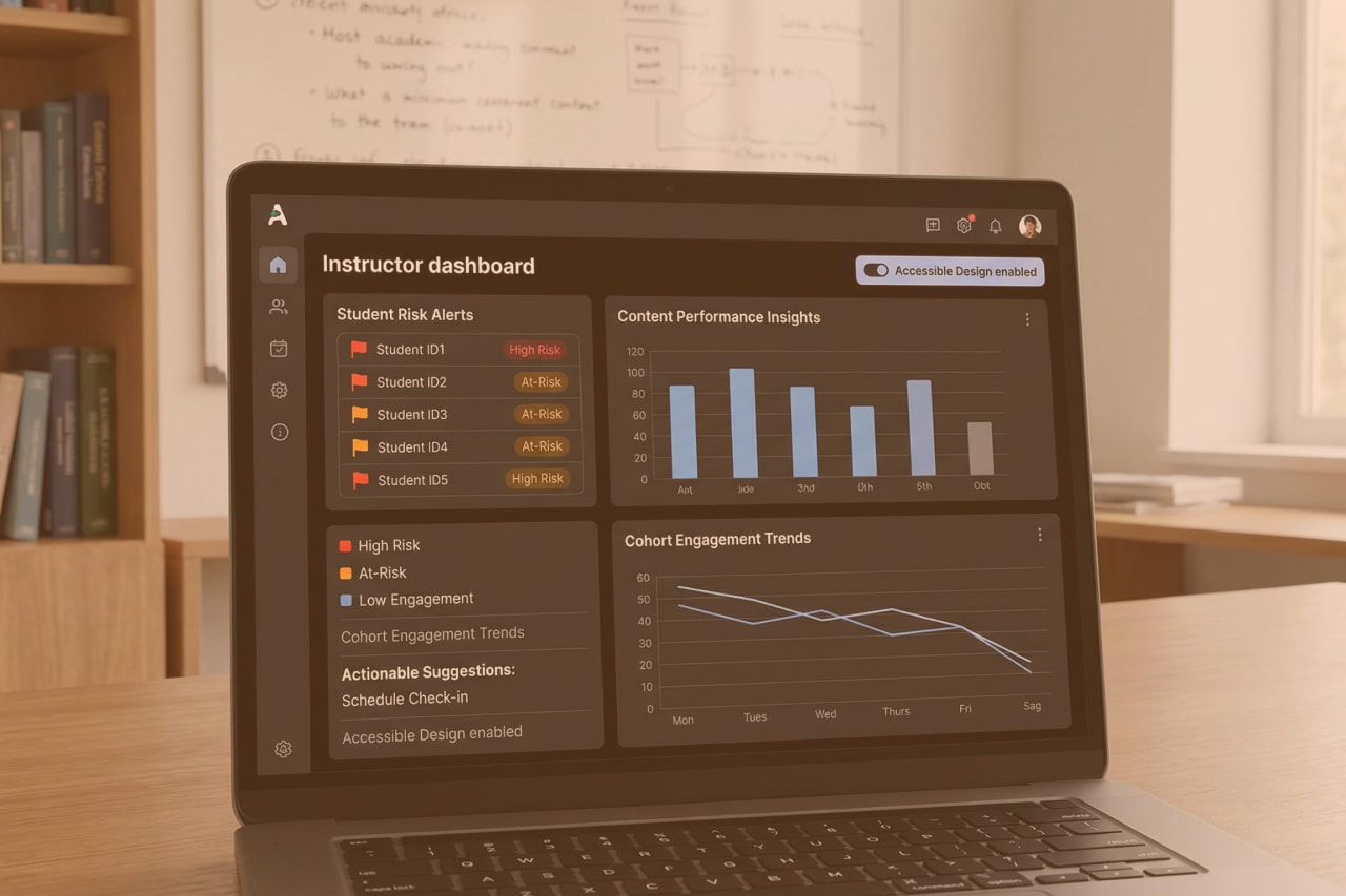
At-Risk Student Flags
Predictive models (e.g. logistic regression or ensemble algorithms) analyze behavioral and performance data to identify students who may struggle or drop out. Rather than waiting for a failing midterm grade, the AI looks for subtle precursors – missing several assignments, low engagement time compared to peers, declining quiz scores – and flags those students weeks earlier. For example, AI-driven dashboard can show instructors how each student studies, where they encounter difficulties, and how they engage with course content.
These insights support more personalized instruction — a foundation also used when designing adaptive learning paths with agentic AI — by highlighting which learners need outreach and why (e.g. Student A hasn’t logged in for 10 days, Student B consistently performs poorly on a certain concept). The system might even assign a “risk score” to each student and update it in real time as new data comes in. Early flagging is only useful if coupled with action – thus, many AI systems now generate recommended interventions alongside each flag (for instance, “Student A is high-risk; consider scheduling a 1:1 meeting”).
Cohort and Trend Insights
AI analytics also operate at the class or cohort level to inform course and program adjustments. By aggregating data, a dashboard can reveal patterns like “Section 2 of this course is consistently lagging behind Section 1 on assignments” or “Engagement dropped by 20% after week 5 across all online sections.” These cohort insights help academic leaders and instructors spot structural issues – maybe one instructor’s pacing is too fast, or perhaps students lose momentum after a certain module. Engagement trend analysis and comparisons across demographic segments can uncover equity issues as well (e.g. one program noticing that first-generation students use optional tutoring far less, indicating a need to promote those resources better). An AI-powered system can crunch thousands of data points to produce such cohort-level signals instantaneously. Importantly, it can surface non-obvious correlations: participation in discussion forums might turn out to be the strongest predictor of final grade in Course X, suggesting instructors should integrate more discussion or at least monitor it closely.
Content Performance & Feedback
Another domain is content analytics – understanding which learning materials and activities drive learning (or don’t). AI can analyze assessment outcomes and engagement metrics to flag content that may need improvement. For instance, if 80% of students get a particular quiz question wrong, the dashboard might tag that question (or the lesson it relates to) as a potential content gap. Similarly, if an e-textbook chapter is largely skipped or a video is re-watched multiple times, the system can infer where content might be confusing or ineffective. Some advanced platforms even employ NLP to analyze open-ended feedback or forum posts to gauge sentiment and concept clarity. In practice, this means the dashboard could suggest, “Students who used Resource Y had a 15% higher test score on Topic Z – consider emphasizing this resource next term,” or conversely, “Module 3 content might be improved; many students requested extra help on these concepts.” By providing content performance insights, AI dashboards help educators iterate on curriculum and teaching strategies with data-driven confidence — insights closely connected to what improves retention, as explored in AI tutor vs simple chatbot.
These AI-driven patterns work in concert. A well-designed AI learning analytics dashboard analyzes real-time data from student interactions — including activity logs, quiz responses, and discussion behavior — to assess concept mastery and engagement levels. It not only flags at-risk learners but can also propose individualized support actions based on emerging patterns. Crucially, it delivers insights at both macro and micro levels: offering an overall class overview while allowing instructors to explore detailed profiles for each student. This multi-scale visibility enables educators to connect course-level trends with student-level needs — allowing proactive adjustments to content, timely interventions for struggling students, and more effective use of high-performing materials.
Designing AI Learning Analytics Dashboards for Action
Even the smartest analytics are wasted if the dashboard UX overwhelms or misleads the user. Designing for actionability means presenting information in a way that triggers decisions. Many legacy dashboards have drowned instructors in charts (clicks, time online, tallies) that are interesting but not actionable – these are vanity metrics. An effective AI-driven instructor dashboard should instead focus on “metrics that matter” for pedagogy and clearly indicate what to do next.
Several design principles emerge from research and practice: simplify, prioritize, contextualize, and integrate. First, simplify the interface to highlight key alerts and insights. Busy teachers don’t have time to analyze dozens of graphs; the dashboard should surface the top 3–5 issues that merit attention each day or week. For example, a prominent panel might list “At-Risk Students (with reasons)” or “Topics needing review (with evidence)” rather than bury these in sub-menus. Emphasize visual cues like color-coded flags or trend arrows to draw the eye to changes that require action (e.g. red icon for a student likely to fail without intervention). Metrics that are merely “nice to know” (e.g. total course hits) should be de-emphasized or hidden behind an advanced view – less is more when it comes to busy educators.
Next, prioritize metrics linked to decisions. If a data point won’t change what an instructor does, question why it’s on the dashboard. For instance, showing that average quiz scores went from 85 to 88 is less useful than highlighting that 5 students haven’t submitted the last assignment. The latter directly suggests an action (follow up with those students). Aligning predictive insights with actionable interventions is paramount. Design teams have found value in co-designing with instructors to identify what data they find most actionable. In one case, researchers built a learning analytics tool with teacher input, and the result explicitly “captures [teachers’] needs [and] supports [their] decisions”. Such user-centered design avoids the common mismatch between what developers think is useful and what actually helps in the classroom.
Contextualization is another critical element. Data should be accompanied by context or recommendations so instructors know why it matters. For example, instead of just presenting a “participation score” of 60 for a student, the dashboard could note this score is 20 points below class average and correlated with an increased risk of dropout. Even better, pair the flag with a suggestion: “consider reaching out via email or office hours.” This way, the dashboard is not just an information portal but a decision-support tool. As one study noted, “translating data into action is complex” – so the system should bridge that gap by recommending next steps or at least providing narrative interpretations (akin to how a GPS not only shows your car’s location, but also tells you where to turn).
Finally, integrate the dashboard into the instructor’s workflow to make acting on insights frictionless. If an alert says “John hasn’t logged in for 2 weeks,” provide a one-click option to message John or notify an advisor. If a content piece is underperforming, link directly to that content’s editor or a knowledge base for improvement. The dashboard shouldn’t be an isolated analysis tool; it should be the command center from which instructors can initiate interventions. Some platforms achieve this by embedding the analytics into the LMS itself (so while grading or viewing class progress, the instructor sees AI suggestions in context). The result of good design is that instructors trust the dashboard and rely on it regularly. A well-designed system can even change culture: when faculty are involved in defining metrics and see the dashboard as a helpful assistant rather than a judgment tool, adoption soars. As evidence, co-designing metrics with faculty has been shown to improve trust and reduce false alarms. In summary, a dashboard built for action focuses on relevant, contextual insights and makes it easy for educators to respond – turning analytics from abstract numbers into a concrete improvement in teaching practice.
Human-in-the-Loop: How Instructors Review & Respond
No matter how advanced the AI, instructors must remain at the center of decision-making in education. The role of these dashboards is to augment human judgment, not replace it. Human-in-the-loop design ensures that while AI systems may flag risks or recommend actions, a human (teacher or academic advisor) makes the final decision and provides critical oversight. This principle is both practical and ethical. Practically, instructors possess context that algorithms lack – they may know a student had a personal crisis or that an assignment was graded leniently, context that could invalidate a generic risk flag. Ethically, keeping a person in control helps prevent over-reliance on opaque algorithms, especially given concerns about bias or errors in AI predictions.
In an AI-enhanced classroom, the instructor’s workflow might look like this: the dashboard raises an alert (say, a student likely to fail a course). The instructor reviews the underlying data – perhaps the student’s low engagement hours and missing assignments are listed as contributing factors. The system might also show an explanation like “attendance < 50% and quiz average < 60%” triggered this flag, to maintain explainability. The instructor then uses their professional judgment to decide on an action: reach out to the student, assign extra practice, or maybe override the alert if they know the situation (e.g. the student is already getting tutoring). By collaborating with the AI, teachers can handle more individualized interventions than would be possible manually, yet every step is still guided by a human touch.
This human-in-the-loop approach is increasingly seen as a non-negotiable in educational AI. As one edtech strategist put it, teachers must maintain oversight and collaboration in AI-driven classrooms to ensure ethical and effective practices. School leaders should formalize this by policy – for instance, analytics recommendations should never auto-email students without a teacher’s approval, and teachers should be trained to interpret and act on AI insights.
Maintaining human control also guards against the pitfalls of algorithmic bias or blind spots. If a model inadvertently flags a disproportionate number of minority or first-generation students as “high risk” due to historical bias in data, teachers and staff can notice and correct this before unjust actions are taken. Some institutions are establishing data ethics committees or requiring periodic audits of learning analytics algorithms to catch such issues.
In summary, human-in-the-loop design isn’t just a safety net; it’s a way to blend AI’s efficiency with educator expertise. The result is a partnership where AI handles the heavy analytics and pattern-recognition, while instructors handle the empathy, context, and nuanced decision-making – together delivering far better outcomes than either could alone.
From Insight to Impact: 8allocate’s Role
Institutions don’t need more charts. They need unified, actionable insight pipelines that instructors trust — and IT can govern. AI learning analytics dashboards only work when powered by clean, real-time data stitched across LMS, SIS, assessment tools, and engagement platforms. But too often, the integration foundation is weak, and the compliance guardrails are missing.
8allocate works with EdTech teams and academic leaders to:
- Build audit-ready, FERPA- and GDPR-compliant data pipelines
- Operationalize AI outputs into instructor workflows (via LMS embeds, real-time alerts, and role-based dashboards)
- Co-design interventions with human-in-the-loop decision logic
AI adoption in education hinges on this integration-first approach. Without it, analytics stall at the insight level. With it, schools move from flagging problems to solving them.
Contact us to assess your learning data architecture and outline a 30–45 day roadmap for integration + AI dashboard pilot.

FAQ
Quick Guide to Common Questions
What are AI learning analytics dashboards?
They are interactive dashboards that use artificial intelligence to analyze educational data and present insights to educators. Unlike standard LMS dashboards, AI learning analytics dashboards aggregate data from multiple systems (LMS, SIS, etc.) and apply machine learning to identify patterns – for example, flagging at-risk students or highlighting which course materials are underutilized. The dashboard provides visualizations and alerts in real time, helping instructors quickly understand class dynamics and take action. In short, it’s a teacher-facing control panel that turns raw student data into actionable guidance for teaching interventions.
How do AI dashboards flag at-risk students?
They continuously analyze various data points for each student and compare them to successful engagement patterns. Using predictive models, the system looks at indicators like assignment completion rates, quiz performance trends, login frequency, discussion participation, and even sentiment in student feedback. If a student’s profile matches patterns associated with struggling or dropout (for example, low activity combined with poor grades), the dashboard will flag that student as “at risk.” Often, a risk flag comes with specific reasons (e.g. “missing 3 assignments and scoring below 60% on quizzes”) so the instructor knows why the student was flagged. Importantly, these flags are an early warning – they prompt the instructor to check in and offer support long before final grades suffer.
How is student data privacy maintained in these dashboards?
Privacy is maintained through strict data governance and compliance measures. First, the system only uses data that the institution has rights to under student privacy laws like FERPA (in the US) or GDPR (in Europe). Personally identifiable information is protected – dashboards typically authenticate users so that teachers only see data for their own students. Data is transmitted and stored securely (with encryption) and often anonymized or aggregated when shown in broader contexts. Many platforms also require active student or parent consent for certain data uses. Institutions set role-based access controls, meaning an instructor can see detailed student analytics for their class, but a higher-level user might only see de-identified trends. Additionally, vendors and IT teams enforce policies on data retention (not keeping data longer than needed) and have audit logs to monitor who accesses what information. In summary, a combination of compliance checks, technical safeguards, and clear privacy policies ensures that AI analytics dashboards support learning without compromising student privacy.
What metrics make a dashboard “actionable” versus just interesting?
Actionable metrics are those that an instructor can directly use to make a decision or intervention. For example, “5 students have not logged in for 10 days” is actionable – the teacher can reach out to those students immediately. “Average time spent on videos is 4 hours” is mostly a vanity metric – it’s interesting but doesn’t tell the teacher what to do. Actionable metrics tend to be specific, timely, and tied to outcomes. These include indicators like: which students are falling below a performance threshold, which learning outcomes or exam topics a class is struggling with, or which course resources have unusually low engagement (suggesting they might need revision). They often appear as alerts or to-do list items on the dashboard. In contrast, vanity metrics are broad counts or aggregates (total page views, overall time on platform, number of forum posts) that might show general engagement but lack a clear call to action. A good AI dashboard might still track those in the background, but it will bring forward the metrics that matter – the ones that tell the educator “something needs your attention here and here’s why.” For instance, a well-designed dashboard might prioritize an “At-Risk Students” list or a “Topics for Review” chart over a general attendance graph. By focusing on actionable metrics, the dashboard ensures that data insights lead to concrete teaching responses.
How can instructors best use AI dashboard insights without relying on them blindly?
Instructors should treat AI dashboard insights as decision support, not automatic truth. The best practice is to review the flags or recommendations and then apply one’s professional judgment. For example, if the dashboard flags a student as at risk, the instructor should cross-check recent interactions – maybe talk to the student or review their work – to validate the concern. It’s also important to understand the dashboard’s explanations: many systems show why a student was flagged or how a prediction was made (e.g. low quiz scores). Instructors should use that as a starting point and consider any context the AI might have missed. Combining the data insight with what the instructor knows about the student (participation quality, personal circumstances, etc.) leads to the best interventions. Essentially, keep the human in the loop: use the AI to notice patterns and save time, but always personalize the response. If something doesn’t make sense (say, the AI claims a usually strong student is “at risk”), the teacher should investigate further rather than act blindly. Over time, instructors will also learn the quirks of the system and can give feedback to improve it. With thoughtful use, AI insights can greatly enhance teaching effectiveness, but they don’t replace the need for teacher engagement and empathy.